Contents
Site Design
|
Introduction Site structure Site elements I Site elements II Intranet design Site Covers |
If you are interested in the World Wide Web you can hardly escape references to hypertext and hypermedia. These days the computer press is full of very fuzzy thinking about how Web-based information can somehow "link everything to everything." The implication is that with the Web you can probably dispense with one of the most challenging aspects of presenting information
Sequence
The simplest way to organize information is in a sequence, where you present a linear narrative. Information that naturally flows as a narrative, time line, or in logical order is idea for sequential treatment. Sequential ordering may be chronological, a logical series of topics progressing from the general to the specific, or even alphabetically sequenced, as in indexes, encyclopedias, and glossaries. However, simple sequential organization usually only works for smaller sites (or structured lists like indexes), as long narrative sequences often become more complex, and thus require more structure to remain understandable.
Grid
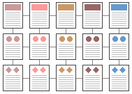
Many procedural manuals, lists of university courses, or medical case descriptions are best organized as a grid. Grids are a good way to correlate variables, such as a time line versus historical information in a number of standard categories such as "events," "technology," "culture," etc. To be successful, the individual units in a grid must share a highly uniform structure of topics and subtopics. The topics often have no particular hierarchy of importance. For example, "tuberculosis" is not more or less important a diagnosis than "hilar adenopathy," but ideally both case descriptions would share a uniform structure of subtopics. Thus the user could follow the grid "down," reading about tuberculosis, or cut "across" the grid perhaps by comparing the "diagnostic imaging" sections of both hilar adenopathy and tuberculosis. Unfortunately, grids can be difficult to understand unless the user recognizes the interrelationships between categories of information, and so are probably best for experienced audiences who already have a basic understanding of the topic and its organization. Graphic overview maps are very useful in grid-like Web sites.

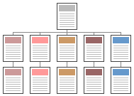
Information hierarchies are one of the best ways to organize complex bodies of information. Hierarchical organization schemes are particularly well-suited to Web sites, because Web sites should always be organized as off-shoots of a single home page. Most users are familiar with hierarchical diagrams, and find the metaphor easy to understand as a navigational aid. A hierarchical organization also imposes a useful discipline on your own analytical approach to your content, as hierarchies only work well when you have thoroughly organized your material. Since hierarchical diagrams are so familiar to in corporate and institutional life, users find it easy to build mental models of the site:

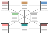
Web-like organizational structures pose few restrictions on the pattern of information use. The goal is often to mimic associative thought and free flow of ideas, where users follow their interests in a heuristic, idiosyncratic pattern unique to each person who visits the site. This organizational pattern develops in Web sites with very dense with links both to other information within the site, and information on other World Wide Web sites. The goal is to fully exploit the Web's power of linkage and association, but web-like organization structures can just as easily propagate confusion and fuzzy thinking about the interrelationships of your information chunks. Ironically, organizational webs are often the most impractical structure for Web sites, because they are so hard for the user to understand and predict. Webs work best for small sites dominated by lists of links, aimed at highly educated or experienced users looking for further education or enrichment, not for a basic understanding of your topic.

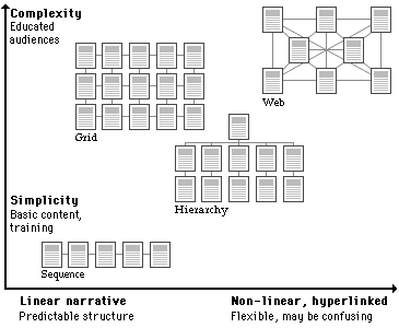
Most complex Web sites share aspects of all four types of information structures. Except in sites that rigorously enforce a sequence of pages, your users are likely to use any Web site in a free-form "web-like" manner, just as most non-fiction or reference books are used. But the nonlinear usage patterns typical of Web surfers do not absolve you of the need to organize your thinking and present it within a clear, consistent structure that complements your design goals for the site. The chart below summarizes the four basic organization patterns against the "linearity" of your narrative, and the complexity of your content.
