Contents
Interface Design
|
Introduction Basic interface design Access issues Navigation Links & navigation |
Users of Web documents don't just look at information, they interact with it in novel ways that have no precedents in paper document design. The graphic user interface (GUI) of a computer system includes the interaction metaphors, images and concepts used to convey function and meaning on the computer screen, the detailed visual characteristics of every component of the graphic interface, and functional sequence of interactions over time that produce the characteristic "look and feel" of Web pages and hypertext linked relationships. Graphic design and visual "signature" graphics are not just used to "jazz up" Web pages

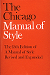
Most of our current concepts about structuring information stem from the organization of printed books and periodicals, and the library indexing and catalog systems that developed around printed information. The "interface standards" of books in the English-speaking world are well established and widely agreed-upon, and detailed instructions for creating books may be found in guides like The Chicago Manual of Style. Every feature of a book, from the table of contents to the index and footnotes has evolved over the centuries, and readers of early books faced some of the same organizational problems facing the users of hypermedia documents today. Gutenberg's bible of 1456 is often cited as the first modern book, yet even after the explosive growth of publishing that followed Gutenberg it took more than 100 years for page numbering, indexes, tables of contents, and even title pages to become routine features of books. Web documents will undergo a similar evolution and standardization of the way information is organized and made available in electronic form.

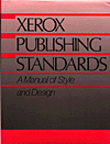
Although networked interactive hypermedia documents do pose novel challenges to information designers, most of the guidance you need to design, create, assemble, edit, and organize multiple forms of media is not radically different from current practice in print media. Most Web documents can be made to conform to The Chicago Manual of Style conventions for editorial style and text organization. Most of what an organization needs to know about creating clear, comprehensive, and consistent internal publishing standards is already available in guides like the Xerox Publishing Standards: A Manual of Style and Design. Don't get so lost in the novelty of Web pages that basic standards of editorial and graphic design get tossed aside.
Make your Web pages free-standing
World Wide Web pages are different from books and other documents in one crucial respect: hypertext links allow users to access a single Web page with no preamble. Thus Web pages need to be more independent than pages in a conventional book. This usually means that the headers and footers of Web pages are more informative and elaborate than printed pages. It would be absurd to repeat the copyright, author, and date of a book at the bottom of every page, but individual Web pages often need such information because a single Web page may be the only part of your site some users ever see. This problem of making documents free-standing is not unique to Web pages. Professional journals, magazines, and most newspapers repeat the date, volume, and issue numbers at the top or bottom of each printed page because they know that their readers often rip out newspaper articles or photocopy pages from journals and need that citation information to trace the original source of the article.
Who
Who is speaking? This question is so basic, and the information is so often taken for granted that Web authors often overlook the most fundamental piece of information a reader needs to assess the provenance of a document: who is saying this to me? Whether the page is from an individual author or an institution, always tell your reader who created the Web page. The flood of Web sites propagating incorrect or actively misleading material on the TWA Flight 800 crash offer a vivid example of how "information" of no known origin or authenticity can quickly come to dominate legitimate inquiry and discussion.
What
All documents need clear titles to capture the reader's attention, but for several reasons peculiar to the Web this basic editorial element is especially crucial. The document title is often the first thing browsers of World Wide Web documents see as the page comes up. In pages with lots of graphics the title may be the only thing the users sees for several seconds as the graphics download onto the page. Additionally, the page title will become the text of a browser "bookmark" if the user chooses to add your page to their list of URLs. A misleading or ambiguous title, or a title that contains more technical gibberish than English, will not help the user remember why they bookmarked your page.
When
Timeliness is an important element in evaluating the worth of a document. We take information about the age of most paper documents for granted: newspapers, magazines, and virtually all office correspondence is dated. So date every Web page, and change the date whenever the document is updated. This is especially important in long or complex online documents that are updated regularly, but that may not look different enough to signal a change in content to occasional readers. Corporate information, personnel manuals, product information, and other technical documents delivered as Web pages should always have revision dates.
Where
The Web is an odd "place" that has huge informational dimensions but few explicit cues to the physical location where a document originates. Click on a Web link, and you could be connected to a Web server in Sydney, Australia, Chicago, USA, or almost anywhere else with Internet connections. Unless you are well versed in parsing URLs it can be difficult to tell where a page originates. This is the World Wide Web after all, and the question of where a document came from is sometimes inseparable from who the document came from. Always tell the reader where you are from, with (if it is relevant) your corporate or institutional affiliations.
References
Lemay, L. 1996. Teach yourself Web publishing in a week, 2nd ed. Indianapolis: Sams Publishing. December, J., and N. Randall. 1995. The World Wide Web unleashed. Indianapolis: Sams Publishing. University of Chicago Press. 1982. Chicago manual of style. 13th Ed. Chicago: University of Chicago Press. Xerox Corporation. 1988. Xerox publishing standards. New York: Watson-Guptill Publications. |